
The current front with arched windows subordinates itself to the main structure and overall appearance of the building. Our suggestion for the redesign of the branch brings out the plinth area as the clear entrance zone and reconfigures the image to the outside.
The cladding is made of light grey glass, with the black and backlit coloured logo and signet mounted on. The window is slightly recessed and passes the pillars, which are coated with black glass. The window itself extends around the corner and defines itself as one element being framed with a highly polished chrome nickel steel-construction leading into the branch.
The main entrance becomes more inviting through a draught lobby, that provides a weatherproof and shadowed area that gives the customer the feeling of an indoor space already in the outdoor zone.
The right side of the cladding is the eye catcher from the “Hauptplatz” and transfers information digitally to the city. It stands out with the yellow colour that defines a leading element through the CI's colouring and proceeds to the inside, serving as an information board.
CI-Elements and their application
As mentioned above, variations of glass are main parts of this project creating the new appearance of Raiffeisenbank Stockerau. Glass stands for transparency, cleanliness, reflection and security and provides high quality in its texture of surface.
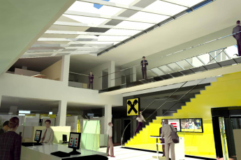
Strengthened by the main colours of Raiffeisenbank (yellow and black), the glass firstly functions as a leading element from the outside to the inside, secondly as a surface providing information for the customer. The colours support easy orientation: the yellow parts are inviting, catching attention, signaling those parts that are meant for the direct use by customers (information board, savings accounts lockers), and the black parts are defining the more closed areas (the pathway to the safe, the cash counter).
Furthermore the flooring emphasises different usage zones that create varying atmospheres and also controls acoustic reflections. The lobby, the internal stairways, as well as the self-service customer area and its entrance zones are lined with hard-wearing material like natural stone, and the more private advisory service scopes are designed with colour matching carpets.
A similar idea is also expressed through the spatial structure. The lobby defines the center of the branch and is partly two storeys high, opening up to the outside with a skylight. As an illusionary element that enhances the openness to the outside, a mirror is placed on the first floor. In contrast the advisory areas are placed more in the back of the branch and are only one storey high.
The transition between these two spatial definitions is rounded up by a rolling screen on the ceiling. Lightening elements support the various spaces, so the outside has a neon tube above the lettering on the leading edge of the projecting roof. The same neon line is suggested to be placed in the pathway to the lobby and the advisory zones of the ground floor. In the lobby itself highlights are created with spotlights.
Besides the CI colours of Raiffeisenbank all other used materials should remain as neutral as possible, meaning white walls and a natural unobtrusive selection of materials in use (the stone and carpet flooring, furniture).